
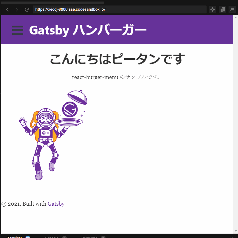
react-burger-menu で簡単にハンバーガーメニューを追加する
react-burger-menu を用いるとReactやReactベースのGatsbyなどのプロジェクトに簡単にハンバーガーメニューを追加できます。
react-burger-menu とは?
https://github.com/negomi/react-burger-menu です。
デモページを見れば、何が実現できるかわかります。
やりたいこと
個人的には、凝ったアニメーションは不要で、SLIDEというタイプで十分かなと思います。つまり、以下のようなものです。
方法
1. react-burger-menu のインストール
npm install react-burger-menu2. Menu.js の作成
- メニューのコードを記述します。
- この例では Gatsby なので、 Link を用いていますが、aタグでも問題ありません。
- 以下のコードで、”slide as Menu”という部分がありますが、この”slide”をアニメーションの種類によって、”stack”とか”bubble”などに設定します。
src/components/Menu.js
import React from "react";
import { Link } from "gatsby"
import { slide as Menu } from "react-burger-menu";

export default props => {
  return (
    <Menu {...props}>
      <Link to="/" className="menu-item" >
        ホームページ
      </Link>

      <Link to="/page-2" className="menu-item" >
        ページ2
        </Link>

        <Link to="/page-3" className="menu-item" >
        ページ3
        </Link>

        <Link to="/page-4" className="menu-item" >
        ページ4
        </Link>
    </Menu>
  );
};
3. ハンバーガーメニューを組み込む
- 今回はLayoutコンポーネント内に組み込みます。
- 以下は、関連する部分を中心とした抜粋です。
- Menuコンポートにwidthというpropsを渡しています。これは表示されるメニューのウィンドウの横幅です。
- propsの指定はなくてもかまいませんが、アニメーションの種類によっては、必要なpropsがあったりします。詳細はドキュメントをご覧ください。
:
import Menu from "./Menu";
:
  return (
    <div id="App">
      <Menu width={250}/>  <--- ここ
      <Header id="header" siteTitle={data.site.siteMetadata?.title || `Title`}/>
        <main id="page-wrap">{children}</main>
:
:
4. CSSを設定する
src\style.css に以下を追加します。
/* Position and sizing of burger button */
.bm-burger-button {
  position: fixed;
  width: 36px;
  height: 30px;
  left: 36px;
  top: 36px;
}

/* Color/shape of burger icon bars */
.bm-burger-bars {
  background: #373a47;
}

/* Color/shape of burger icon bars on hover*/
.bm-burger-bars-hover {
  background: #005b99;
}

/* Position and sizing of clickable cross button */
.bm-cross-button {
  height: 24px;
  width: 24px;
}

/* Color/shape of close button cross */
.bm-cross {
  background: #bdc3c7;
}

/*
Sidebar wrapper styles
Note: Beware of modifying this element as it can break the animations - you should not need to touch it in most cases
*/
.bm-menu-wrap {
  position: fixed;
  height: 100%;
}

/* General sidebar styles */
.bm-menu {
  background: white;
  padding: 2.5em 1.5em 0;
  font-size: 1.15em;
}

/* Morph shape necessary with bubble or elastic */
.bm-morph-shape {
  fill: #373a47;
}

/* Wrapper for item list */
.bm-item-list {
  color: #b8b7ad;
  padding: 0.8em;
}

/* Individual item */
.bm-item {
  display: inline-block;
  text-decoration: none;
  outline: none;
}

/* Styling of overlay */
.bm-overlay {
  background: rgba(0, 0, 0, 0.3);
}